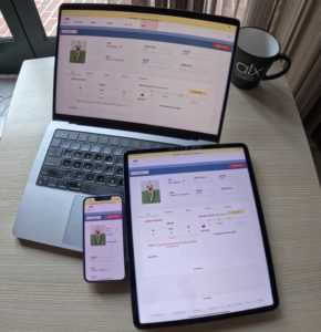
When working in software and technology in general you will often hear people say “UI/UX Design” referring to “user interface” (UI) and “user experience” (UX) design as a single entity. While often this role at a company utilizes people skilled in both disciplines, they are not the same skill set and are distinct aspects of product design. A product can have a beautifully designed UI with terrible UX, or vice versa. Ideally a product does both well, but push comes to shove which one is more important?
User Experience (UX) Design
UX Design encompasses things like the layout of information and interaction with the system as a whole. The overall structure, flow of information, and points of interaction within a system. It is at this stage of the product planning and design process where you ask questions like, “What is a user trying to accomplish when they are visiting this page?” or, “What information is most important and should be most salient from the first moment someone looks at this?”. In short, you are problem solving from a user’s perspective to design something in a human-centric way so they can easily accomplish their desired tasks. Answering these questions allows UX designers to create experiences that please the user and seem intuitive and useful as they interact with the system. For the digital world, you are designing the interaction experiences between a person and the digital product. Don Norman, often considered the father of modern UX, speaks of, “User Experience [as] encompass[ing] all aspects of the end-user’s interaction with the company, its services, and its products”. User experience can apply to anything you use, not just digital products. For example: A swinging door with a flat metal plate has been designed to visually communicate to a human that you should push the door to open it, whereas a vertical handle bar would signal it was meant to be pulled to open.
User Interface (UI) Design
UI design is the next step for digital products, and unlike UX it is much more specific to the digital world. UI Design is when a designer will take the work completed during the UX planning and turn those designed experiences, layouts, etc. into a visually appealing and responsive experience for users interacting with the digital interface. In essence UI design is typically the point when digital products marry the planned user experience with visual design (buttons, typography, icons, color schemes, etc.). This is where branding, colors, visual design systems, and other elements really come into play to turn a planned experience into a beautiful (hopefully!) digital product.
UX or UI?
You might be wondering because they are distinct practices is one more important or is it possible to do one well and not the other. Our general answer is yes, to both.
Whether UI or UX is more important may differ based on your business goals, but we tend to put more emphasis on UX design during product development because it’s typically the more expensive thing to significantly alter later on and it’s the core experience that can both drive people away from or attract people to your product.
Generally if forced to pick one, a product with a great user experience that might look clunky or dated from a visual design perspective will succeed better than a visually slick product that is frustrating or unintuitive to use. People might download your app or sign up for your product because it looks visually appealing, but the thing that tends to keep people engaged or give your app staying power over the long haul would be a positive, intuitive, user experience as they are actually trying to use your product to accomplish their related tasks and goals. Is it possible to do both well? Absolutely! This is the ideal scenario, but it’s not necessarily a reality, even for successful products & brands. Let’s look at an example of each combination.
Good UX, Modern UI
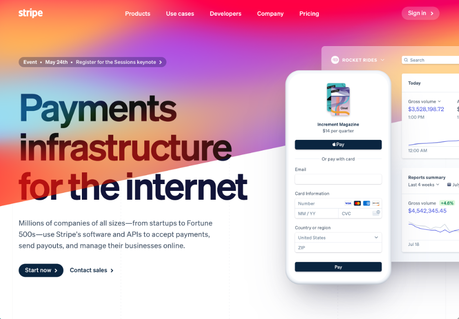
Stripe, a payment processor, is a good example of a site that has both good UX upon arrival and a pleasing and modern UI through it’s use of design elements. When I arrive on their home page, I am informed of exactly what Stripe is, shown an example of their product, and given a logical set of options that might interest me in their top-level navigation bar, without having to scroll or click anywhere.
Poor UX, Modern UI
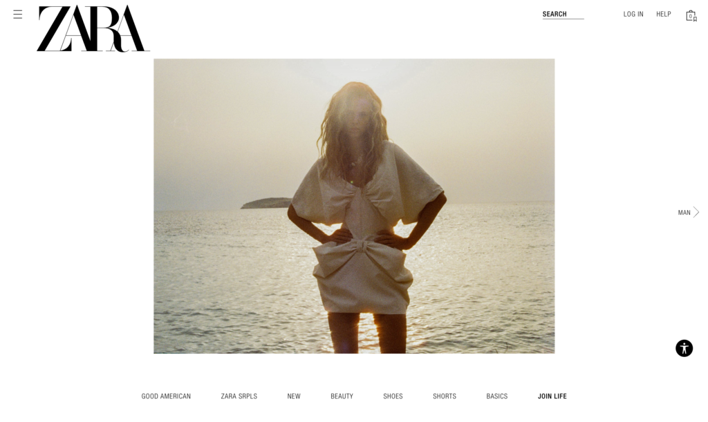
The popular clothing store Zara is an example of a site that has a clean, modern style UI design and a lackluster user experience. If you were to go to their website and you didn’t already know exactly what Zara was, there is little present to give you any context that it is a clothing store or that you can shop on their site. Clicking on items in what appears to be a category-based navigation bar on the bottom only serves to rotate the featured photo and does not take you anywhere useful to shop or view items in that category.
Good UX, Dated UI
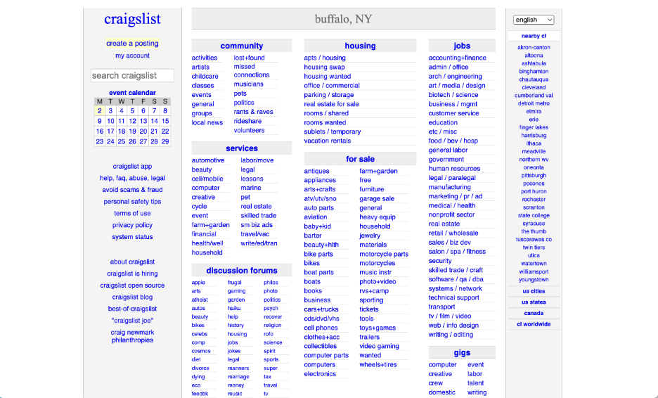
Craigslist is a great example of a site that is easy to use and lacks flashy or modern visual design. From a visual design perspective it uses a very plain design scheme and a lot of default web styles with little if any branding, visuals, or any elaborate color scheme (blue is the default color for web links). Yet despite its almost total disregard for UI design elements, craigslist has been holding it’s own as an online marketplace and posting board for over 25 years.
Poor UX, Dated UI
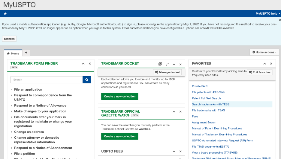
The United States Patent and Trademark user portal we consider to have a really poor user experience for authenticated users, as well as a dated user interface design. As you might imagine, if I have filed a trademark with them, I would probably log into my account wanting to check the status of that application. To-date (~7 months of holding the account), we have found no place on the dashboard or otherwise that allows you to see the status of applications you filed associated with your email/account without having to look each one up manually. Pretty much everything in their dashboard for account holders is a collection of links to publicly available web pages. To check the status of your application, even if it’s tied to the same email and was submitted with your account, you have to dig up the original conformation of submission email in your separate email inbox, pull out the ID numbers manually, and put them into the same public form as if you didn’t have an account at all. Which begs the question why they bother offering accounts at all. It’s a really lackluster UI from a design perspective and a really frustrating user experience if you want to check the status of any applications. They can get away with such a poor user experience because they have a captive audience and no competition in the marketplace for their services.