
In our very data-driven world, we are constantly looking at charts, graphs, infographics, and other applications of data visualization that impact how we understand the information being presented. Making the understanding of underlying information easy or difficult is a choice we inherently make when we decide how to encode that data in our visualizations. Based on how humans perceive and process incoming information, we can make better, deliberate choices when presenting data to users so that it is more immediately helpful, understood, and easy to compare.
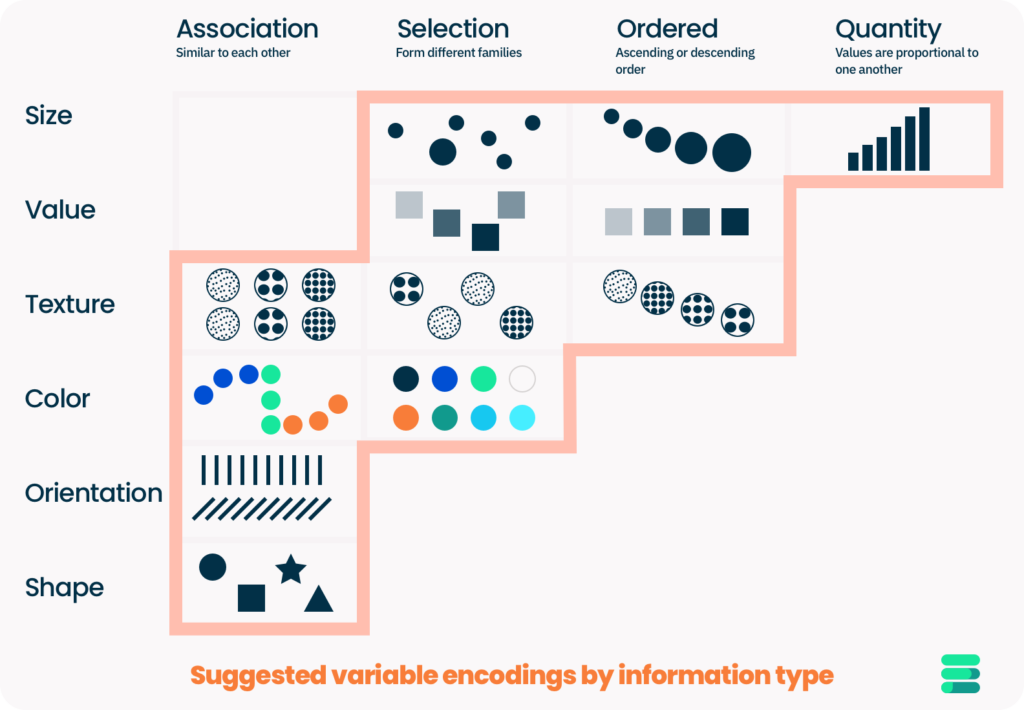
Bertin’s Variables
In the mid 20th century, a french cartographer name Jacques Bertin developed a concept of visual variables. He identified seven primary variable types for communicating different information which were: value (lightness), hue (color), texture, shape, size, orientation (changes in alignment), and position.
Depending on the type of data you are presenting, you should select which variable encoding you will use to communicate your data with care, based on the type of data you are presenting and what your goals are when communicating the data. That way it will have the biggest immediate impact and desired understanding by a user. Information is data that has been put into relevant context(s) so that it becomes something useful to the person viewing or making decisions from it.
Encoding Quantitative Data
When you are encoding data that is quantitative, meaning the numerical values or measures of each item are relative to one another, size is one of the best ways to communicate and compare those relative changes. However, our brains are better at detecting certain types of size changes than others. How you choose to convey/encode those relative size differences will make it easier or more difficult for users to make meaningful comparisons between values.
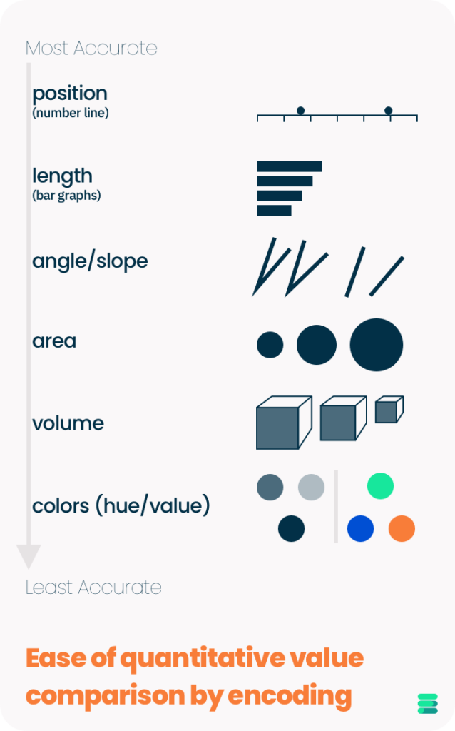
It should come as no surprise that the the ways we are most accurate and capable of detecting size changes are the standard plotting mechanism for mathematics and one of the most commonly used graph types.
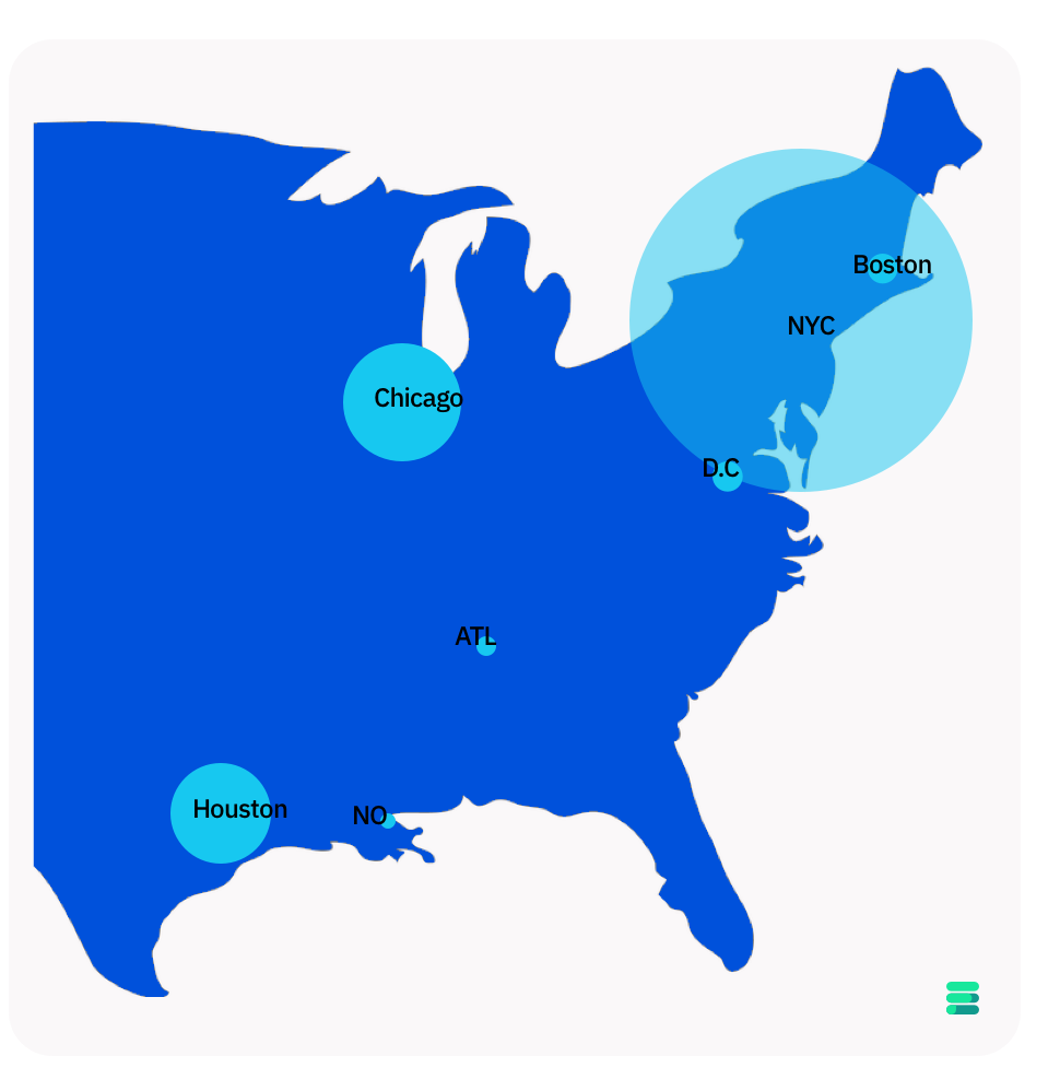
Other encoding mechanisms such as area are sometimes used to show relative quantities but they are not as effective if comparing numerical values accurately is your main concern. If you are trying to convey the difference in population size generally between locations, using a larger point marker may be sufficient for your needs to show that New York City has a considerably larger population than Chicago. However allowing someone to draw finite, accurate, and meaningful conclusions about the difference in population size between Chicago and Houston would be much more difficult. The difference in area is much smaller, and our brains are not as good at estimating the slight change in size.
Next time you need to make a dashboard or other data visualization, we hope you will keep these concepts in mind so that you can create data visualizations with the most impact and usefulness to users.
Bertin’s Book: Semiologie Graphique
Many concepts and fundamentals included in this post come from teachings in Gregory Gerling (Ph.D)‘s Systems Engineering course on Human Factors, which our founder took as a student at UVa.